The You In Your Phone

Look at your phone – the way its setup, the layout of app icons on the homescreen, the most used apps, the total number of apps, the theme it has on, the wear on the body, how close is it to running out of storage space, which brand it has stamped on it, how new it is, how frequently it rings, how loud its kept, how bright it is, the number of hours it is stared into, how protected it is, how quickly it discharges, how slow it is and what decoration it has. Think about how those little things about your device describe you.

Within its screen is a sacred space for your consciousness to navigate through at ease. It is not the simplest of tools made by man, yet it is available to all and usable by most. This little monolith you carry with you – plastic intricately fused with sand and metal – this is the tombstone of the modern man, which he carries with himself. He perfected all the techniques and knowledge to give himself a new rock. And for this award, he will forego all the other old ways he had devised to be remembered. He will throw away his talismans, tags, chains, watches, rosary and rings.

Similar things, though, could be said about other objects we use, but the mobile phone is the object we reach out to the most, consistently, throughout our waking days and nights. There is no other object which centers our physical existence like the mobile phone.

Such a recent change, and why should I not fear something like that.

Trees – A Physical & Living Data Visualization Tool

Looking at the tree in my backyard yet again, I tried to guess its name but unfortunately I am no arborist – for me it is a tree of medium height which blossoms with white flowers in spring and glows bright red before bursting naked into leaves towards the end of fall. Maybe it is the lockdown, but I fully recognize that I am obsessed with this tree. This is a being I look at first thing in the morning everyday, and I take its pictures at random in different weather and seasons. This is much more serious a case than the mango tree I grew up in front of.

I look at trees as beings of a superior intelligence. Describe it however you may but, for me, intelligence is nothing but efficiency. A humanist might say things like, “But we have satellites and nukes, we have the internet making the electrons dance for our entertainment – how can you say that trees are more intelligent than us?” I ask in return, “All of this is impressive, but what is it for?” We are solving these complex problems for nothing but our survival in the most efficient manner possible, and we are far from getting there. That, while these ancient beings have perfected survival in the leanest way, without the extra paths and layers of abstractions, and we don’t even know much about them despite their simplicity. Yes, we can cut and burn down forests at the greatest rates possible but that is no efficiency when it comes to our survival. Also, these beings exist for many human lifetimes with ecosystems they set in place and sustain.

The effects of Gleick’s Chaos were still fresh in my mind, maybe riding the summer along in that mood was what left a deep imprint, but all I can say is that my outlook towards order and disorder will never be the same. I am as much a mathematician as I am an arborist, so I will just write whatever comes to my mind as I glance at this entity which stands slightly off center in my backyard (It stands at a very visually harmonious point and I am certain it has something to do with the golden ratio, but I would not pursue this further). The idea comes from branches of this tree, which grow differently on its different sides, most probably because of the sun’s path. On one end they scatter and spread out at random whereas on the other they rise vertically, clustered together but never crossing each other, almost like bristles of a toothbrush.

The algorithm taking care of this truly must be magnificent, and it would have worked as effectively for the thousand different places where this same tree could have grown. Every morning as I look at this tree while finishing my first cup of coffee of the day, I see new patterns in it no different than the ones left at the bottom of my cup by the grounds in my last careful sip. I think the only other entities which place importance on this tree are the two squirrels that fool about on it.

We can consider trees to be a mathematical function, like all living things, in a dynamic equilibrium. They could, however, be treated as the best examples of a living function since they are static in position all their lives. Once an organism can be held down in space for its entire lifetime, a lot of additional variables can be avoided. I am certain that such a function for a tree would still be simpler than that of an amoeba. Some of the key variables this function consumes are the wind, water, sunlight, gravitational force, soil nutrients and temperature – the basic determinants of the state of the environment and the world, especially the volume specifically local to the tree. The tree is not just a living function which just consumes these variables but it influences these variables in return as well. Without going into the details, one can safely call the tree a physical and live data visualization of all these factors impressed on that given volume of space in the world. Thus, the tree is the best codification and representation of the environmental factors put upon a volume on earth. It is just that we have a limited knowledge about which factor or measurement points to which facet of the environment. I think our study of trees has been just that, trying to find those relations – but hopefully we should not get caught in the relations we make to the intermediary factors instead of the bigger scale phenomenon.

Destin from Smarter Every Day mentions how a tree vibrated form the trunk along two perpendicular planes still shows oscillations at its top-end branches along the same plane – this definitely has something to do with the cancelling effects of the oscillations and their dispersal in the ‘chaotic’ system which the branches are. It must be mentioned that the branches are themselves the result of the wind gusts the tree experiences throughout its lifetime – to know how this oscillating plane of the end branch relates to the average historical wind direction would be an interesting study to undertake.

Trees are at the intersection of the world and the measuring tools that we use to understand and predict it. Or, they can also be considered to be the measuring instruments which we have not yet fully learned to use. They are a physical data representation of complex systems which our supercomputers will never be able to accurately model – and maybe, we never should try to sweat over knowing these complex indeterministic systems at all but just work with the simplified data a tree can provide. I also see the future weather forecast stations to have networks of tree farms being measured and monitored across the world.

Data coded in morphology is long known of, I assume; but looking at the organism itself as the visualization of the external factors might require more exploration – it is like reading the lines on someone’s palm to predict the weather. All we have to do now is to learn how to read nature and its brilliant visualization tools. This is something we, as humans, have done since our very beginning but I feel our tech saturated present has led us astray from that path.

Redesigning The Indic Keyboard

https://www.instagram.com/p/B_rkWKUgM0m/?igshid=7hhwdaxbe77q


I have always found it hard to learn and use the InScript keyboard (standardized keyboard layout for Indian scripts), and even before I could start learning it, the transliteration keyboard (Google Input Tools) was what helped me bridge the gap and type in Hindi using the English alphabet. This is one of the ways I text my family, we represent the two different approaches to typing in our language – where one has become accustomed to the visually cluttered Indic keyboard as they had the chance to start afresh, while the other was brought up communicating in Hindi using the English alphabet, and all Google had to do was to recognize those words and replace them with their Hindi equivalents.
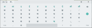
InScript Keyboard:

If we look at the InScript keyboard, (which is a layout that rides on top of the QWERTY keyboard layout) one can appreciate the effort put into condensing so many characters into a limited space, but that also makes us question whether this layout really was really ‘designed’.

The decision to cluster the vowels to the left of the keyboard is a wise one, but then having the consonants span the alphabet, number and symbol keys is counter to this effort.

For a key offering multiple inputs, there are two ways to access the secondary or tertiary character it allows for, which is by either pressing the Shift or the Ctrl key before the desired key. Thus, there are additional steps introduced to access the alternate key-space which has regularly used characters in it, which is otherwise reserved for the lesser-occurring capital characters for English.

The vowels offer their corresponding diacritics separately for conjunction with consonants in this alternate input space – using up more retail space in the process.

Also, certain commonly occurring consonant-consonant conjunction diacritics are given their own key inputs, while certain common conjunctions have their own keys.

For someone who is trained in using these keyboards, I am sure that it is effortless to input text in Hindi or any other Indic language – the muscle memory would definitely make a few additional Shift keys pressed insignificant – but thinking of the versatility of the design, it fails in the digital space – which does offer countless infinite and alternate layouts to be added to the same area in line with the Inscript layout, but then it also clamps down on the very strengths and capabilities of the intangible medium. Also, I see it to be very difficult to learn from an accessibility perspective for users with low-vision, where a single key has multiple character input options with numbers and symbols sharing space with regular characters.
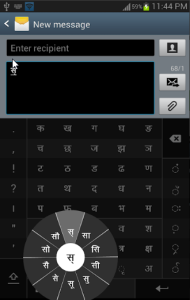
 

Other Solutions:

There has been a huge improvement over these drawbacks when it comes to intangible input interfaces – these on-screen keyboards, some of which have tried to bypass the problems of layout with excessive characters and extra key inputs to generate a single character, are discussed below:

The Google Indic Keyboard removes the clutter by arranging all the vowels in a single row at the top – these change based on the consonant selected, after which they display that consonant with the vowel diacritic. The numbers, characters and symbols are each given their own alternate layout space.

The Swarachakra keyboard also decreases the number of taps by offering the alternate characters and their corresponding conjunctions with a long tap on a particular key.

I also came across the research done on physical keyboard layouts such as Keylekh and Barakhadi series, both of which are derived from user study data. However, if a keyboard becomes too different in its layout from the norm which is QWERTY, its manufacturing and, ultimately, ubiquity become a concern.

After looking at all of the solutions, I saw potential in a layout that can work for both intangible as well as tangible interfaces. There have, of course, been some designs suggested to improve the input rate (the word per minute typing speeds for Indic languages are way lower than that for English, more so for digital interfaces). The reality is that designing a keyboard absolutely separate from what is the norm is an uphill battle, thus, sticking to the QWERTY format is a practical and an important constraint.

The Concept:

This concept improves the layout and interaction of a Hindi/Devanagari input keyboard (but can be applied to any other Indic script).

– Like in the existing InScript layout, the vowels are grouped to the left and the consonants to the right.

– As there is no uppercase, characters accessible with a Shift press are the ones with a lower occurrence within that key pair (overall needs to be better optimized and rearranged based on character-use frequency data).

– Removed separate keys for the maatraa or vowel diacritics, which are now added by their corresponding vowel keys when pressed after a consonant input.

– If the vowel follows a consonant as a separate character, a special dis-connector key is pressed in between the two inputs. This interaction is inverse to the conjunction key which is usually pressed in other designs.

– Consonant conjunctions occur the same way as in existing designs.

Further Work:

I will try to create a digital prototype to get more feedback on this idea.

This layout works on a standard QWERTY keyboard layout and can even be tested/demonstrated physically by reassigning the Unicode values for the keys.

An extension of this exercise would be to look at a keyboard which enables physical micro-interactions, at the key-level, that would change the character diacritic (suggested by Shiveesh).

Devneogari

https://www.instagram.com/p/B-n4iVEAc6f/?igshid=h1lpyq71y18c

The craving for home nowadays, without the distractions of ‘normal’ life, grows even stronger and ends up manifesting in small actions I often catch myself doing. I realized how long had it been since I wrote in my own language (the last attempt was over a year back when I started signing my name in Hindi) and on a whim this time, I started scribbling the alphabet. I must now admit that I am ashamed of having forgotten the order of the varnamala of my own mother tongue. That ranks pretty high in the stages of de-racination – which is a war I have been fighting with myself lately. 

As someone interested in languages, I started thinking of the influences Sanskrit had on the Eastern Asiatic Languages and wondered if the former’s script could borrow from the aesthetics of the latter – say, Hangul or Japanese. Also considered the scenarios where Devanagari could be written vertically, which would be possible if there wasn’t the connecting upper line for words (called a shirorekha).

As I started writing line after line without the shirorekha, I felt that a lot of the curves could be reduced to straight lines and angles – the upper line also served the purpose of aesthetically balancing all the curves and lines binding them into one complex shape, which was the word. This shape is not only was the word but its exact pronunciation. The script now looked different yet familiar, but the words were difficult to partition so I introduced forward-slashes after every word as separators where sentences would end with a double forward-slash. Filled a couple of pages with Kabir’s couplets, which did briefly take me back to the Hindi classes in school.

20200504_200136

While I was at it, I could not help but think of Blade Runner 2049, which is an amazing movie to watch for anyone who is in the creative line of work – the movie is entirely a visual and aural inspiration board (will write a separate post about the it sometime). It featured Hindi in multiple shots, shown as one of the many languages of the society of the future – which does make sense given how much it is neglected despite being one of the largest spoken languages in the world. The representation was fair, not over-compensating as it shared an equal footing with other languages of the world, and most importantly, it was correct – because the worst thing to see, when non-European languages are being represented in western entertainment, is a cringe-worthy mistake, where you know that someone did not bother to run a check on the content after translating it on Google.

And so, I envisioned this script to be something of the future, in the brightly lit signs dotting a dystopian megapolis, where every important street would look like Paharganj on steroids.

Observations/Feedback:

My roommate could read it right away with some confusion in certain characters I had taken too much creative liberty with, other friends mentioned that connecting characters without the upper line was difficult for them. I also noticed that the character sizes looked really odd, their differences now accentuated by the absence of the upper connector line, and this definitely needed a touch of a typographer – someone who knew their kerning etc.

I spent three hours on the phone with Shiveesh the next day – an intense discussion about culture and languages of India. He made an interesting remark about Devanagari and why ridding it of its upper connector-line does not make sense to him, something which I do partly agree with – ‘the organic shapes..meaning curves and all.. give a unique characteristic look to Devanagari because it was developed on leaves as a medium, and the typography needed a structure that had visual contrast as it cuts against the grain.’

True. But this also brings up the question, which is – should the script also evolve with the medium that carries it, or should it remain true to its original medium and continue unchanged?

Could Devanagari take on a new skin for seven-segment displays and/or machined/laser-etching applications?

Conclusion:

I think this style of writing, though more difficult to decipher compared to the existing script, has its benefits – in signage limited to a word or two, vertically writing in Hindi, and etching of Devanagari by machines where curved toolpaths add to cost and time of finishing a part. There might also be benefits to the volume of ink saved in paperwork against dense Devanagari script (again, a new medium) with its curves and shirorekha – the latter could be literally looked at as striking-through each word.

But since this was just another weekend design exercise, yet again overthought, it definitely needs to be more legible with the right touch of a typographer – because what is the use of even a hundred the benefits when most people cannot read it.

03 – The Side Table

https://www.instagram.com/p/BrP1QDJhI1o/?utm_source=ig_web_button_share_sheet

Once I cut through the block of pine that I had used for my shape optimization tests. I think I got in the groove where I wanted to make more tables. In the last two weeks before my departure for home, I built a small side table with a walnut top and pine legs.

It is a simple design inspired from the form of a temple gate or torana. Lightweight and portable, it can be placed in a corner or along a wall and can find use as a nightstand or as a surface on which prayer items could be placed, or even just as a decorative piece by itself.

I decided that this handcrafted piece would make a great gift for my friend who would be getting married by the time I reached India. The table fit perfectly in my luggage in between the rolls of clothes and safely completed its journey of a bus ride and two international flights. I am glad that it was received well and now occupies a corner as one of the first furniture pieces in their new home.

Seat Frame: Shape Optimization Test

https://www.instagram.com/p/Bs9nyefBxSA/

I wanted to put Autodesk Fusion360‘s Simulation feature to work. I decided to create a block that supports the three legs of a stool and ran the space optimization study over it. Using a plastic like ABS in the simulation and MDF for the legs, I could get an estimate of the stress-contours (best among woods and plastics). I used these as templates to remove excess material and decided to 3D print a piece, a slide in joint/frame for my seat.

Now this is the step which is not the right way to go about testing a part for strength – since plastic has a non-linear Young’s modulus and 3D printed parts are neither really solid nor with uniformity among the layers, FDM is definitely not the way to obtain a test piece (however SLA printed parts fare better in this). But I did it anyway, to see how much this shape could take with a ten percent infill just with the defining walls on the outside making up this part – would anyway be a good indicator.

Surprisingly, everything fit well and the seat was able to take my weight, but because of the lack of joinery, it would wobble and slide out of the fixtures with any movement. So, as a way to keep this piece serving some purpose, I just applied some wood glue to the dowels and jammed them between the legs and the top.

For future, this frame could incorporate a clever locking mechanism for the legs and maybe have a smoother, more organic surface without the very much visible fillets.

Quick Build: Piezo-Pickup Casing

Months ago, when my roommate managed to buy a sweet Fender acoustic guitar from a student who was moving out, I mentioned that he get a piezo-electric pickup. We found the cheapest one on Amazon for about ten dollars, and after receiving it, we realized that we had no way to secure it to the guitar maybe apart from drilling a hole through its body for the output jack. So, the project lay dormant until yesterday. I love small projects like these where excess material can find some purpose.

Sunday – just pulled out a block of pine from my box of materials and took some measurements of the pickup’s components.


Monday – managed to cut a casing with just those measurements (without the pickup as the reference) only to return home and find that some of my estimates were way off.

Tuesday – tried to make this casing again from scratch, having the pickup with me for reference helped cut down the time considerably. Upon coming home, I attached the casing on the guitar with velcro and then decided to utilize the previously failed piece as an extension to it (so that it has more area to stick to and is easier to remove and attach). I plugged in the pickup to my processor and it sounded pretty damn good across most patches. Also reinforced the original wire by wrapping it with really loud “Chenille Stems”.

Wednesday – Glued the previously failed piece to the new casing, sanded down the faces and put some wax to make it shine. Invited my friends to try it out on Friday.


Flood Protection For Automobiles

The changing global climate shows up every year with its stronger than ever hurricanes and floods. A major section of the world population resides along the coasts or such major water bodies, and it is common to see a flood happening somewhere in the world at any given time of the year. What I saw among that property damage were the perfectly good vehicles, sometimes new ones still in the dealership lot, that have been ruined and will probably end up in a scrap sale or clearance auction.

This is a design for protection of vehicles against floodwaters. It is an inflatable device which is first spread under the vehicle like a mat and then is inflated to keep the automobile above the water level. Material must be chosen to make it last the longest duration of floods. These floating devices are ribbed under the surface to provide protection and strength. Other than their primary use, they can also be used as boats to transport goods, people and rescue material. There could even be a mechanism which inflates these via the car’s exhaust system. As it can be deflated and stored in the trunk or in the garage – it is an easy to store and quick to deploy system.

The Experience Design of Ragas

For most people, vibe is important. Ambiance is another term some like to use. But overall, people enjoy and pay more for an immersive experience. This has been central to the new improvements in the entertainment and media industry. The design industry has also found itself talking more and more about experience of using and interacting with a product or a service. People now have things which communicate with sight, sounds, touch and smells and almost everyone is exploring ways to set the perfect mood for an experience – whether it is for long lasting emotional design or planned obsolescence, all are aiming for an experience that goes beyond the product/service itself.  At its core, it is about making things more immersive. New fronts are emerging as we find relationships between sensations, sensors and technologies. But the number of augmentations really do not determine the quality of experience, this is often neglected and misunderstood. This is the reason why we often hear things like, ‘bad sound’,  ‘bad lighting’, ‘three dead in a pyrotechnic accident’; or we see a restaurant with lighting that makes the food look like crap and a lounge where social interaction is expected but the music prevents it.

For music, what was once a simple equalizer dancing within the confines of a screen (initially a utility of monitoring sound levels for different frequencies) has now mapped to low-cost smart lights in one’s living room for the parties. Up the budget for a concert and you have something grand yet similar, but it is tailored for the venue and the performer (smoke, confetti, water cannons, flames etc.). Things are also changing with VR, where listening to a song could also mean being the protagonist in its music video.

With all that said, I want to talk about something old.

I cannot help but think of Hindustani classical music in the context of experience design, and more specifically the concept of ragas. Even though there is lots to discuss about the rituals, instruction and hierarchies, all of which I know nothing about, there is something about the entire system which is very organic and sophisticated. The people who framed these rules knew that it was not just about the music (product/service – depends on how one looks at it) but the entire experience. Ragas are, by design, an immersive experience rather than a simple set of notes to improvise along with. Traditionally, ragas are to be performed at a particular time of the day and even have appropriate seasons designated for their performance. This is probably an early example of where entertainment was designed with the environment in the mind. It had to reflect back, through music, what the environment presented; and given the absence of technology at that time, a master performing a raga at the correct time and season would have yielded a mood that is really difficult to recreate with all our screens, smoke, flames, sprays and amplification. Among these, amplification is an interesting tool as its presence or absence also raises questions like – should an audience beyond a certain number really witness this performance? Would architecture across the world evolve differently if we had access to modern amplification methods? Would that have also affected the instruments we have today?

As Western music took the main seat in the world, the ambiance of entertainment was now sourced in the replication of concert halls which was only made more colorful with open air stages etc. The music too has distanced from the nature worshiping pagan traditions, and is now a projection from man on to his environment (the western approach where man is at the center of his reality – a closed-in approach which I feel was guided more by the climate than philosophy or religion) – it became important to create and impose the vibe rather than let it come in from the outside. Even the western instruments had to eventually mic into modern amplification to cater beyond what they could deliver by themselves and the spatial acoustics. And with all the tech, attempts are rigorous to subconsciously guess at and recreate the conditions that might best complement a song. The right answer perhaps will come when we open our senses to the world before applying our sensors to it.

Cliché – ‘Feel Good’ Business Terms

Whenever my job search takes me to a website of a company, there are a few words I absolutely expect to see – the careers section is, of course, the one I am looking for but then it comes with the others, sometimes nested within and sometimes they sit right around it. Businesses trying to put on a human face is an old and overused act, but since these words span the size, business ethics, industry and ideology of the business it is something worth mentioning. That said, these terms are unavoidable in these times where almost every one is projecting their virtue but my reason for writing this, as a designer, is that we can do perfectly well without any of it – it is an unnecessary practice.

Diversity and Inclusion – Usually shows a person of color or someone in an ethnic attire (or wearing some part of it) standing in a corporate boardroom surrounded by people in suits or business casuals. This has almost become an icon for diversity for websites of businesses. It reveals a fantasy of the inclusion and the ratios to which it is desired. Never have I come across such a photo of one white guy in a room full of, say for example, Indians – I am sure some of these big companies have offices in Mumbai where expats work. Is this inclusion only based on the race or the sexual orientation of a person (the latter only when it is very much visible in a photo)? Why do they miss out on the countless people who have a disability but still are a part of the workforce?

Sustainability – Any human activity, whether it is the production of goods or service, is unsustainable towards the environment. Sustainability is just a word for lean production practices where costs are saved while also avoiding penalties from the EPA or its equivalent. Yet, places where these regulatory authorities are missing, things are very different. The only thing that is being sustained are the profits, nothing else. It only gets worse as the businesses scale up in size. I think a better and more honest alternative for sustainability should be ‘damage control’.

Corporate Social Responsibility – This is an old one and most people know about it – photos of kids from a third world country in a school equal tax breaks.

It is often tempting as someone creating content to be carried away by these terms. Though no casual client or applicant would check whether the statements made are true or not, but this practice does add to the overall redundant and ever-growing clutter that most information on the internet comes with. And it gets all the more painful when some really sophisticated design firms can be seen doing this.

Rendered Errors

Spent a few hours tonight playing around with Fusion360’s rendering service on the lattice I have been trying to create (and print). The results were impressive, especially with all of the reflective surfaces and the ever repeating geometries. One of the renders did fail. It left me mid-way, after an hour’s wait, with something that was incomplete yet cool – straight out of a high school NCERT Physics or Math book!

I will try to post more updates on the project as well.

Printing That Shit

‘Are you friggin’ kidding me?’

This was the usual response of friends and teachers to one of the main ideas I was considering for my thesis. And I cannot blame them either, because the concern was legit – shit was involved, literally. After many discussions, I finally told myself that additive manufacturing with human feces would be a project I must save for another lifetime. In retrospection though, I too agree that it would have been a bit too much – I saw myself, a year from then, clutching at whatever little that remains of my hair staring at a brutally hacked filament extruder which was either: a. unable to extrude the material (aka constipation) OR b. extruding it at undesirable rates (aka diarrhea). Either one of that happening, and that too at a graduate thesis exhibition show in a crowded art gallery, would make it the perfect disaster.

‘Dude, as if shitting on the streets for you guys (Indians) was not enough..’

Though the highly sanitized modern societies manage to project the image of the penultimate pristine very well by pushing the excrement under the rug (or the streets), the problem is not really gone and it re-surfaces every now and then in every corner of the world (usually happens when it rains a lot). The attitudes towards management and handling waste vary but all in all, it is looked at as a thing that must be immediately gotten rid of. The truth is, all of our civilization and us are covered in filth – of our own excretions and those of others. Come to think of it, societies are the best way to come into direct and indirect contact with the excrement of others. What was once limited to probably the animals and the family on the farm now extends to everyone who sat on that toilet seat or touched the door knob of that high-society lounge you and I might wish to visit. With that at their core, societies strive for ‘cleanliness’. Over hundreds of years, we have solved certain problems and introduced practices that positively transformed health and hygiene at a global level, but with that attitude we are also flushing the baby out with the bathwater.

Building Material Of The Future – Here and Beyond

Used as a fertilizer, fuel and a construction material regardless of time and place – it is only sensible to see it as the next big problem as well as the answer to the mounting pile of humans and their excreta. A few efforts have briefly brought some attention to the potential of feces as a construction material but the stigma is an understandably great one to overcome. This also prevents further work towards solutions that will help, and the reactions I experienced, ranging from understandingly disagreeing to extreme mockery, were a good example of that. The common concern of biological hazard and odors has been addressed long ago and the only thing that requires work is our perception. Think of it – an abundantly available ecologically friendly material that can and has been used to create strong composites!

As we are expanding our reaches into the space, talks about colonizing Mars are getting serious with every passing day. Dealing with humans and their waste will thus be more important than ever. Since energy efficiency is of utmost importance in space missions, researchers are exploring ways to fully utilize this space poop (as an energy source), which would otherwise be stored and hauled back to earth. They have been doing that with urine and astronauts already get enough questions on that. Also, no matter how tempting it sounds, we cannot just let packets of frozen human feces drift for a millennia until they land on a planet wiping out an alien life (or even birthing it). So, the solution will be simple for us – we will have to figure out a way to use our own feces to construct these new worlds. And when it is 3D printed (ie. if my hypothetical extruder works by then in Mars’ gravity, I am also fine with throwing lasers at sewage sludge blended with a photo-polymer if that looks cooler) and setup by an army of robots, the possibilities can be endless. All humans would need to do would be to wake up from their deep sleep upon their arrival and move into their new Martian homes made out of waste collected from the previous missions. As they live, they shall also contribute their bit for the future occupants of that community. Will be just like the stories where the filth off one’s body was used to create heroes and their armor.

Suggested Links:

https://www.economist.com/prospero/2016/05/09/merdacotta-domestic-objects-made-from-dung
https://www.citylab.com/design/2013/04/sustainable-furniture-line-made-agricultural-waste/5270/
https://www.theguardian.com/artanddesign/2007/dec/04/art
https://www.cnbc.com/2018/06/18/president-trump-directs-pentagon-defense-department-to-immediately-being-the-process-of-establishing-space-force-as-sixth-military-branch.html
https://www.theguardian.com/technology/2018/mar/11/elon-musk-colonise-mars-third-world-war
https://www.nasa.gov/feature/winners-of-space-poop-challenge-receive-30000
https://www.usatoday.com/story/news/politics/2017/06/08/nasa-chief-says-2018-budget-ensures-mars-mission-still-track-2033/102642420/
https://www.sciencedirect.com/science/article/pii/S221455241730041X
https://www.biorxiv.org/content/biorxiv/early/2018/04/02/288746.full.pdf

Concept: Automobile Climate Control Interface


https://www.instagram.com/p/BadZxCIAeHG/

For one of our course assignments, we were asked to choose and redesign a widget we frequently interact with. I picked the climate control dials in our cars,  which vary with different cars and take up unnecessary space on the dashboard.


This concept for the new widget consists of concentric dials, each of which control a parameter of the automobile’s indoor climate – the center is a scrolling sphere through which air direction mode and even vent settings in-between two modes can be chosen.

This was a quick build and I kept the explanation at its simplest with three concepts – one being the framework I started with, the other a widget made of physical dials and the third one specific to touch interfaces.

Explaining the concentric dials (outer to inner):

  • Temperature : Air conditioner/Heater/Fan
  • Fan Speed : 0 to 10, controllable from both clockwise and counterclockwise rotation
  • Air Intake Control
  • Air Direction Vent Control Trackball