Sanskritize Your Passwords

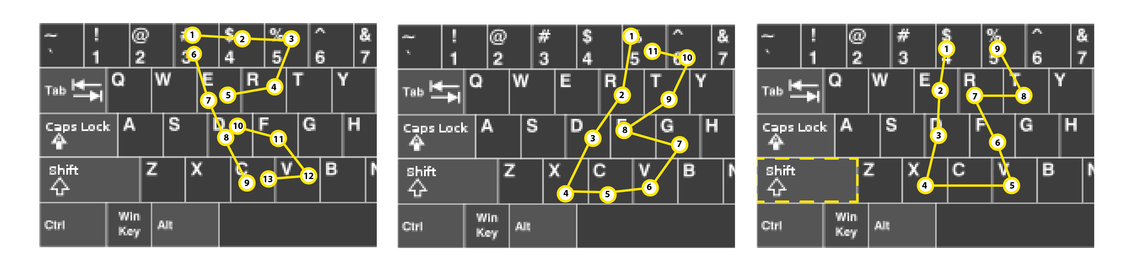
A couple of years back, I had posted something on creating complex yet recallable passwords by transposing letter shapes on the standard available keyboard. We will continue along those lines, in the timeless manner of using language alone to build individually understandable complexity, which is a delicate balance of chaos and order. Language in itself is ordered complexity, but its rules can be flouted, as like how a child would and chaos be quickly created. Your mental space resides somewhere in that region.

The most frequently used passwords, which are typed in every day ritualistically, quickly become entrenched in one’s muscle memory. This becomes apparent when one returns to the machine after a long break, or while trying it on a different equipment, or when the UI or the workflow to typing in that password has changed ever so slightly. But, it is quick to recall the orchestration of one’s fingers, and even override the old pattern with a few practise runs. This is the first thing one might do for frequently used passwords, even before referring to the hint or other recall methods.

But when that doesn’t work, hints are used – these can be straightforward mentions of what the password is, or are equally cryptic. Usually these strings are only apparent to the users themselves, or a small number of people. Even in this case, one’s ability to recall the details is crucial, and this bit often fails.

Using Native Language

For bilingual people, and especially for people familiar with different scripts, new avenues of creating and remembering passwords open up. As you go about your life, you are encrypting and decrypting information in the languages you know, a non-stop process of mental transliteration and translation to the language you think in.

Let us assume that the password or hint string is ‘121212’. Here is how someone who knows both Hindi and English can recall this string:

Legible to English Speaker:

Onetwoonetwoonetwo, twelvetwelvetwelve…

Vntoovntoovntoo,  twlvtwlvtwlv….

Legible to Hindi Speaker:

एकदोएकदोएकदो, बारहबारहबारह…

Legible to Bilingual person:

Hindi in Latin: baarahjanvarybaarah, baarahbaarahbaarah, ekdoekdoekdo, eksauikkisdosaubaarah..

English in Devanagari: वनटूवनटूवनटू, ट्वेल्वट्वेल्वट्वेल्व, वनट्वेन्टीवनटूट्वेल्व..

Hindi in Latin as a hint: raajakajanmdin, saalgirah, duniyakaannt..

English in Devanagari as a hint: दकिंग्ज़बर्थडे, एनिवर्सरी, डूम्सडे..

For shorter strings – like 2j2, the letters used to spell its characters themselves (teedabluohjeteedabluoh) could be transliterated to: टीडब्लिऊओजेटीडब्लिऊओ

Hieroglyph on your tongue

As obscure tongues have always been used by inner circles to maintain knowledge and secrets, we will explore another such layer of complexity with ancient languages. These languages continue to live in modern languages and yet they are considered dead. Since we are using Devanagari and Latin scripts here in the examples, let us introduce Sanskrit which lets us harness the power of long compound words and well defined conjunction and word joining sound rules. We can combine any word with another (while disregarding grammar). We can even transliterate English terms and compound them with other words as if they were Sanskrit. The examples here might be absurd, but they are only bound by the limits of absurdity of their creator’s inner monologue.

news speed light city -> वार्ता त्वरा प्रकाश नगर -> वार्तात्वराप्रकाशनगर -> vaartatvaraaprakaashnagar

fast typing friend -> तरस्वत् लेखः मित्रम् -> तरस्वल्लेखोमित्रम् -> tarasvallekhomitram

These are not foolproof solutions and have their own vulnerabilities – anyone who recognizes the scripts and has an internet connection could crack these without even knowing the languages. But, this method does help in obtaining strings which are probably do not exist in a dictionary. Because the Latin script is limited in capturing the correct pronunciation on regular keyboards, and because people transliterate the same word differently, writing these without space helps make them more confusing except to the person who has created these strings.

This process, thus, can be layered within a stack of other obfuscation methods. You can create a phrase, translate it to Sanskrit, and transliterate the sentence back. Utilizing physical media and strategies related to the medium will definitely help in making this effective.

https://en.wikipedia.org/wiki/Sanskrit_compound
https://en.wikipedia.org/wiki/Sandh
https://learnsanskritlanguage.com/grammar/starting-out/making-words/compound-words/
https://openpathshala.com/sandhi-in-sanskrit
https://learnsanskrit.org/start/nouns/sandhi/
https://greenmesg.org/sanskrit_online_tools/sanskrit_sandhi_tool.php
https://www.learnsanskrit.cc/index.php?mode=3&direct=au&script=hk&tran_input=city

Trees – A Physical & Living Data Visualization Tool

Looking at the tree in my backyard yet again, I tried to guess its name but unfortunately I am no arborist – for me it is a tree of medium height which blossoms with white flowers in spring and glows bright red before bursting naked into leaves towards the end of fall. Maybe it is the lockdown, but I fully recognize that I am obsessed with this tree. This is a being I look at first thing in the morning everyday, and I take its pictures at random in different weather and seasons. This is much more serious a case than the mango tree I grew up in front of.

I look at trees as beings of a superior intelligence. Describe it however you may but, for me, intelligence is nothing but efficiency. A humanist might say things like, “But we have satellites and nukes, we have the internet making the electrons dance for our entertainment – how can you say that trees are more intelligent than us?” I ask in return, “All of this is impressive, but what is it for?” We are solving these complex problems for nothing but our survival in the most efficient manner possible, and we are far from getting there. That, while these ancient beings have perfected survival in the leanest way, without the extra paths and layers of abstractions, and we don’t even know much about them despite their simplicity. Yes, we can cut and burn down forests at the greatest rates possible but that is no efficiency when it comes to our survival. Also, these beings exist for many human lifetimes with ecosystems they set in place and sustain.

The effects of Gleick’s Chaos were still fresh in my mind, maybe riding the summer along in that mood was what left a deep imprint, but all I can say is that my outlook towards order and disorder will never be the same. I am as much a mathematician as I am an arborist, so I will just write whatever comes to my mind as I glance at this entity which stands slightly off center in my backyard (It stands at a very visually harmonious point and I am certain it has something to do with the golden ratio, but I would not pursue this further). The idea comes from branches of this tree, which grow differently on its different sides, most probably because of the sun’s path. On one end they scatter and spread out at random whereas on the other they rise vertically, clustered together but never crossing each other, almost like bristles of a toothbrush.

The algorithm taking care of this truly must be magnificent, and it would have worked as effectively for the thousand different places where this same tree could have grown. Every morning as I look at this tree while finishing my first cup of coffee of the day, I see new patterns in it no different than the ones left at the bottom of my cup by the grounds in my last careful sip. I think the only other entities which place importance on this tree are the two squirrels that fool about on it.

We can consider trees to be a mathematical function, like all living things, in a dynamic equilibrium. They could, however, be treated as the best examples of a living function since they are static in position all their lives. Once an organism can be held down in space for its entire lifetime, a lot of additional variables can be avoided. I am certain that such a function for a tree would still be simpler than that of an amoeba. Some of the key variables this function consumes are the wind, water, sunlight, gravitational force, soil nutrients and temperature – the basic determinants of the state of the environment and the world, especially the volume specifically local to the tree. The tree is not just a living function which just consumes these variables but it influences these variables in return as well. Without going into the details, one can safely call the tree a physical and live data visualization of all these factors impressed on that given volume of space in the world. Thus, the tree is the best codification and representation of the environmental factors put upon a volume on earth. It is just that we have a limited knowledge about which factor or measurement points to which facet of the environment. I think our study of trees has been just that, trying to find those relations – but hopefully we should not get caught in the relations we make to the intermediary factors instead of the bigger scale phenomenon.

Destin from Smarter Every Day mentions how a tree vibrated form the trunk along two perpendicular planes still shows oscillations at its top-end branches along the same plane – this definitely has something to do with the cancelling effects of the oscillations and their dispersal in the ‘chaotic’ system which the branches are. It must be mentioned that the branches are themselves the result of the wind gusts the tree experiences throughout its lifetime – to know how this oscillating plane of the end branch relates to the average historical wind direction would be an interesting study to undertake.

Trees are at the intersection of the world and the measuring tools that we use to understand and predict it. Or, they can also be considered to be the measuring instruments which we have not yet fully learned to use. They are a physical data representation of complex systems which our supercomputers will never be able to accurately model – and maybe, we never should try to sweat over knowing these complex indeterministic systems at all but just work with the simplified data a tree can provide. I also see the future weather forecast stations to have networks of tree farms being measured and monitored across the world.

Data coded in morphology is long known of, I assume; but looking at the organism itself as the visualization of the external factors might require more exploration – it is like reading the lines on someone’s palm to predict the weather. All we have to do now is to learn how to read nature and its brilliant visualization tools. This is something we, as humans, have done since our very beginning but I feel our tech saturated present has led us astray from that path.

COVID-19: Household PPE Disposal

With how the things have been for the past two months now, it is interesting to see something which was the focus of my thesis become a topic of discussion at all levels, everywhere. There is, however, an aspect which will surely become a hot topic in the months that follow – it concerns the generation of plastic waste during this pandemic and its appropriate disposal.

If the increased consumption of single-use plastics wasn’t enough, there is also the fact that even when meant for reuse, these cannot be recycled once contaminated. Hospitals have a waste stream which is tightly segregated and regulated, where contaminated waste goes straight to the incinerator and there are special waste management teams or companies handling that.

I am concerned about how this plays out at a household level, where personal protective equipment is being disposed across into the regular waste streams. As there is no separate bin for waste with either biological or chemical contamination, I feel the surge of PPE being disposed off from households will lead to new problems. Most local waste collection companies also do not anticipate, nor are prepared, to deal with this biologically hazardous waste which will come in mixed with the household trash. Though the situation before allowed for minor occurrence of such bio-hazards in the stream, a significant increase in that, in either the regular trash or recycling streams, would add on to the problems.

I think it is absolutely necessary that along with the correct use of masks (in which there was demonstrably a huge knowledge gap), people should also be informed about the correct way to dispose off their contaminated PPE. The details of disposal need to be stated as clearly as they are in the infographics on correct mask use. Currently, all disposal is vaguely mentioned and incorrectly shown as flinging a used mask into a trashcan – addressing that other part of the product’s life cycle is really necessary this time.

Redesigning The Indic Keyboard

https://www.instagram.com/p/B_rkWKUgM0m/?igshid=7hhwdaxbe77q


I have always found it hard to learn and use the InScript keyboard (standardized keyboard layout for Indian scripts), and even before I could start learning it, the transliteration keyboard (Google Input Tools) was what helped me bridge the gap and type in Hindi using the English alphabet. This is one of the ways I text my family, we represent the two different approaches to typing in our language – where one has become accustomed to the visually cluttered Indic keyboard as they had the chance to start afresh, while the other was brought up communicating in Hindi using the English alphabet, and all Google had to do was to recognize those words and replace them with their Hindi equivalents.

InScript Keyboard:

If we look at the InScript keyboard, (which is a layout that rides on top of the QWERTY keyboard layout) one can appreciate the effort put into condensing so many characters into a limited space, but that also makes us question whether this layout really was really ‘designed’.

The decision to cluster the vowels to the left of the keyboard is a wise one, but then having the consonants span the alphabet, number and symbol keys is counter to this effort.

For a key offering multiple inputs, there are two ways to access the secondary or tertiary character it allows for, which is by either pressing the Shift or the Ctrl key before the desired key. Thus, there are additional steps introduced to access the alternate key-space which has regularly used characters in it, which is otherwise reserved for the lesser-occurring capital characters for English.

The vowels offer their corresponding diacritics separately for conjunction with consonants in this alternate input space – using up more retail space in the process.

Also, certain commonly occurring consonant-consonant conjunction diacritics are given their own key inputs, while certain common conjunctions have their own keys.

For someone who is trained in using these keyboards, I am sure that it is effortless to input text in Hindi or any other Indic language – the muscle memory would definitely make a few additional Shift keys pressed insignificant – but thinking of the versatility of the design, it fails in the digital space – which does offer countless infinite and alternate layouts to be added to the same area in line with the Inscript layout, but then it also clamps down on the very strengths and capabilities of the intangible medium. Also, I see it to be very difficult to learn from an accessibility perspective for users with low-vision, where a single key has multiple character input options with numbers and symbols sharing space with regular characters.


Other Solutions:

There has been a huge improvement over these drawbacks when it comes to intangible input interfaces – these on-screen keyboards, some of which have tried to bypass the problems of layout with excessive characters and extra key inputs to generate a single character, are discussed below:

The Google Indic Keyboard removes the clutter by arranging all the vowels in a single row at the top – these change based on the consonant selected, after which they display that consonant with the vowel diacritic. The numbers, characters and symbols are each given their own alternate layout space.

The Swarachakra keyboard also decreases the number of taps by offering the alternate characters and their corresponding conjunctions with a long tap on a particular key.

I also came across the research done on physical keyboard layouts such as Keylekh and Barakhadi series, both of which are derived from user study data. However, if a keyboard becomes too different in its layout from the norm which is QWERTY, its manufacturing and, ultimately, ubiquity become a concern.

After looking at all of the solutions, I saw potential in a layout that can work for both intangible as well as tangible interfaces. There have, of course, been some designs suggested to improve the input rate (the word per minute typing speeds for Indic languages are way lower than that for English, more so for digital interfaces). The reality is that designing a keyboard absolutely separate from what is the norm is an uphill battle, thus, sticking to the QWERTY format is a practical and an important constraint.

The Concept:

This concept improves the layout and interaction of a Hindi/Devanagari input keyboard (but can be applied to any other Indic script).

– Like in the existing InScript layout, the vowels are grouped to the left and the consonants to the right.

– As there is no uppercase, characters accessible with a Shift press are the ones with a lower occurrence within that key pair (overall needs to be better optimized and rearranged based on character-use frequency data).

– Removed separate keys for the maatraa or vowel diacritics, which are now added by their corresponding vowel keys when pressed after a consonant input.

– If the vowel follows a consonant as a separate character, a special dis-connector key is pressed in between the two inputs. This interaction is inverse to the conjunction key which is usually pressed in other designs.

– Consonant conjunctions occur the same way as in existing designs.

Further Work:

I will try to create a digital prototype to get more feedback on this idea.

This layout works on a standard QWERTY keyboard layout and can even be tested/demonstrated physically by reassigning the Unicode values for the keys.

An extension of this exercise would be to look at a keyboard which enables physical micro-interactions, at the key-level, that would change the character diacritic (suggested by Shiveesh).

Folder and File Tree Navigation

https://www.instagram.com/p/B_MYONpA6is/?igshid=x61yuekixns6

Anyone who knows me well is also aware of the unhealthy obsession I have with backing up my data, manually. People who relate to that also understand the importance of keeping a track of one’s selections deep inside a folder chain, especially when one is working with large amounts of data. I have come across various ways in which some sort of a signifier is added to an element in a tree-list to convey its selection state and respective parent-child relationships that it may have. These range from the standard node connections used in the classic Microsoft Windows UI (now replaced with indentations) to common motifs in the icons which act like colored tags (as in the body and feature trees of some CAD modelling UI) .

This method of information display is the most familiar one across UIs whenever large file and folder chains are to be visually represented in a limited retail space; compared to an actual visual representation of the tree, it only makes a limited section of the list visible to the user – this, too, is displayed sequentially via scrolling action. Thus, it becomes easy to lose one’s location in a large folder tree, also, navigating out of it and in between the parent folders adds to the clicks and the scrolls unnecessarily.

To address some of these issues, I decided to work with a hypothetical file tree which would have two kinds of elements at every node, these would be the folders (expandable and collapsible elements) and files (nodes with a dead-end). Then constraining myself to not use anything similar to a line, to show the hierarchies, I decided to go with a very Gestalt approach to make this visible.

I also made use of a very wise solution noticed in the Visual Studio UI which highlights changes, additions and removals in the lines of code in a file in the scroll bar itself.

Also having the parent entities have an always-present representation for quick access made sense against scrolling all the way to the top to find the parent element.

I spent two nights just sketching the visually different concepts and seeing how they fare against the scenarios I had imagined in this hypothetical file tree. It was surprising how much a shift or spacing by a single character could make such a big difference in the overall interaction capabilities for such a UI component. Once finalized, spent a night creating the assets and animating them on Adobe After Effects.

The proposed concept takes into account multiple use-case interactions with a file and folder tree.

  • The subdued gray dots convey the hierarchy between the list elements, these darken right from the top of the folder chain, when hovered over.
  • Selections are marked blue and their appropriate node connections remain visible, a colored-dash signifier also appears in the scroll bar conveying the global location of the selections in the list.
  • Once an expanded parent folder gets obscured, as it is scrolled out of the view window, an abstract element takes its place (this will be at the top as the file-folder lists are sequential and top-down) which can still convey the selection or hover state with a change of color. Hovering over this displays the name of the obscured parent folder and clicking on it snaps the view back to this element at the top.

Devneogari

https://www.instagram.com/p/B-n4iVEAc6f/?igshid=h1lpyq71y18c

The craving for home nowadays, without the distractions of ‘normal’ life, grows even stronger and ends up manifesting in small actions I often catch myself doing. I realized how long had it been since I wrote in my own language (the last attempt was over a year back when I started signing my name in Hindi) and on a whim this time, I started scribbling the alphabet. I must now admit that I am ashamed of having forgotten the order of the varnamala of my own mother tongue. That ranks pretty high in the stages of de-racination – which is a war I have been fighting with myself lately. 

As someone interested in languages, I started thinking of the influences Sanskrit had on the Eastern Asiatic Languages and wondered if the former’s script could borrow from the aesthetics of the latter – say, Hangul or Japanese. Also considered the scenarios where Devanagari could be written vertically, which would be possible if there wasn’t the connecting upper line for words (called a shirorekha).

As I started writing line after line without the shirorekha, I felt that a lot of the curves could be reduced to straight lines and angles – the upper line also served the purpose of aesthetically balancing all the curves and lines binding them into one complex shape, which was the word. This shape is not only was the word but its exact pronunciation. The script now looked different yet familiar, but the words were difficult to partition so I introduced forward-slashes after every word as separators where sentences would end with a double forward-slash. Filled a couple of pages with Kabir’s couplets, which did briefly take me back to the Hindi classes in school.

20200504_200136

While I was at it, I could not help but think of Blade Runner 2049, which is an amazing movie to watch for anyone who is in the creative line of work – the movie is entirely a visual and aural inspiration board (will write a separate post about the it sometime). It featured Hindi in multiple shots, shown as one of the many languages of the society of the future – which does make sense given how much it is neglected despite being one of the largest spoken languages in the world. The representation was fair, not over-compensating as it shared an equal footing with other languages of the world, and most importantly, it was correct – because the worst thing to see, when non-European languages are being represented in western entertainment, is a cringe-worthy mistake, where you know that someone did not bother to run a check on the content after translating it on Google.

And so, I envisioned this script to be something of the future, in the brightly lit signs dotting a dystopian megapolis, where every important street would look like Paharganj on steroids.

Observations/Feedback:

My roommate could read it right away with some confusion in certain characters I had taken too much creative liberty with, other friends mentioned that connecting characters without the upper line was difficult for them. I also noticed that the character sizes looked really odd, their differences now accentuated by the absence of the upper connector line, and this definitely needed a touch of a typographer – someone who knew their kerning etc.

I spent three hours on the phone with Shiveesh the next day – an intense discussion about culture and languages of India. He made an interesting remark about Devanagari and why ridding it of its upper connector-line does not make sense to him, something which I do partly agree with – ‘the organic shapes..meaning curves and all.. give a unique characteristic look to Devanagari because it was developed on leaves as a medium, and the typography needed a structure that had visual contrast as it cuts against the grain.’

True. But this also brings up the question, which is – should the script also evolve with the medium that carries it, or should it remain true to its original medium and continue unchanged?

Could Devanagari take on a new skin for seven-segment displays and/or machined/laser-etching applications?

Conclusion:

I think this style of writing, though more difficult to decipher compared to the existing script, has its benefits – in signage limited to a word or two, vertically writing in Hindi, and etching of Devanagari by machines where curved toolpaths add to cost and time of finishing a part. There might also be benefits to the volume of ink saved in paperwork against dense Devanagari script (again, a new medium) with its curves and shirorekha – the latter could be literally looked at as striking-through each word.

But since this was just another weekend design exercise, yet again overthought, it definitely needs to be more legible with the right touch of a typographer – because what is the use of even a hundred the benefits when most people cannot read it.

Neuomorphic As An Interaction State

https://www.instagram.com/p/B9d911wATG4/?igshid=ft2xw5h3c4z0

I came across a video explaining the hype around neumorphism – something fresh in these times of absolutely flat UI. This visual style serves the middle ground between the flatland and the realm of skeuomorphism.

Working on this little project over the weekend, I decided to make neumorphism function more as a micro-interaction state in regular flat UIs, i.e. it was to happen to or ‘bring up’ the element only when it was hovered over. This was inspired from futuristic physical interfaces which break the flat plane and take the form of physical buttons and switches when the user approaches them – though making this happen in the real life is not easy, the digital medium allows for just that.

General Atomics MQ-9 Reaper

I had been putting off my tribute to this machine for quite some time. Also had to do something serious with Autodesk Sketchbook on the Samsung Galaxy Tab I had purchased over Thanksgiving. While I have managed to get a lot of minor design work done on it (storyboards and edits), I had not really sat down with it to do some solid non-stop sketching and rendering. It was part under-confidence and part procrastination which was causing this delay, but I guess today was the Sunday when this had to happen. The absence of masks does make rendering difficult in Sketchbook but there are workarounds – mine being not the correct one, for sure. It was a fun total of two hours nonetheless.

03 – The Side Table

https://www.instagram.com/p/BrP1QDJhI1o/?utm_source=ig_web_button_share_sheet

Once I cut through the block of pine that I had used for my shape optimization tests. I think I got in the groove where I wanted to make more tables. In the last two weeks before my departure for home, I built a small side table with a walnut top and pine legs.

It is a simple design inspired from the form of a temple gate or torana. Lightweight and portable, it can be placed in a corner or along a wall and can find use as a nightstand or as a surface on which prayer items could be placed, or even just as a decorative piece by itself.

I decided that this handcrafted piece would make a great gift for my friend who would be getting married by the time I reached India. The table fit perfectly in my luggage in between the rolls of clothes and safely completed its journey of a bus ride and two international flights. I am glad that it was received well and now occupies a corner as one of the first furniture pieces in their new home.

Flood Protection For Automobiles

The changing global climate shows up every year with its stronger than ever hurricanes and floods. A major section of the world population resides along the coasts or such major water bodies, and it is common to see a flood happening somewhere in the world at any given time of the year. What I saw among that property damage were the perfectly good vehicles, sometimes new ones still in the dealership lot, that have been ruined and will probably end up in a scrap sale or clearance auction.

This is a design for protection of vehicles against floodwaters. It is an inflatable device which is first spread under the vehicle like a mat and then is inflated to keep the automobile above the water level. Material must be chosen to make it last the longest duration of floods. These floating devices are ribbed under the surface to provide protection and strength. Other than their primary use, they can also be used as boats to transport goods, people and rescue material. There could even be a mechanism which inflates these via the car’s exhaust system. As it can be deflated and stored in the trunk or in the garage – it is an easy to store and quick to deploy system.

The Experience Design of Ragas

For most people, vibe is important. Ambiance is another term some like to use. But overall, people enjoy and pay more for an immersive experience. This has been central to the new improvements in the entertainment and media industry. The design industry has also found itself talking more and more about experience of using and interacting with a product or a service. People now have things which communicate with sight, sounds, touch and smells and almost everyone is exploring ways to set the perfect mood for an experience – whether it is for long lasting emotional design or planned obsolescence, all are aiming for an experience that goes beyond the product/service itself.  At its core, it is about making things more immersive. New fronts are emerging as we find relationships between sensations, sensors and technologies. But the number of augmentations really do not determine the quality of experience, this is often neglected and misunderstood. This is the reason why we often hear things like, ‘bad sound’,  ‘bad lighting’, ‘three dead in a pyrotechnic accident’; or we see a restaurant with lighting that makes the food look like crap and a lounge where social interaction is expected but the music prevents it.

For music, what was once a simple equalizer dancing within the confines of a screen (initially a utility of monitoring sound levels for different frequencies) has now mapped to low-cost smart lights in one’s living room for the parties. Up the budget for a concert and you have something grand yet similar, but it is tailored for the venue and the performer (smoke, confetti, water cannons, flames etc.). Things are also changing with VR, where listening to a song could also mean being the protagonist in its music video.

With all that said, I want to talk about something old.

I cannot help but think of Hindustani classical music in the context of experience design, and more specifically the concept of ragas. Even though there is lots to discuss about the rituals, instruction and hierarchies, all of which I know nothing about, there is something about the entire system which is very organic and sophisticated. The people who framed these rules knew that it was not just about the music (product/service – depends on how one looks at it) but the entire experience. Ragas are, by design, an immersive experience rather than a simple set of notes to improvise along with. Traditionally, ragas are to be performed at a particular time of the day and even have appropriate seasons designated for their performance. This is probably an early example of where entertainment was designed with the environment in the mind. It had to reflect back, through music, what the environment presented; and given the absence of technology at that time, a master performing a raga at the correct time and season would have yielded a mood that is really difficult to recreate with all our screens, smoke, flames, sprays and amplification. Among these, amplification is an interesting tool as its presence or absence also raises questions like – should an audience beyond a certain number really witness this performance? Would architecture across the world evolve differently if we had access to modern amplification methods? Would that have also affected the instruments we have today?

As Western music took the main seat in the world, the ambiance of entertainment was now sourced in the replication of concert halls which was only made more colorful with open air stages etc. The music too has distanced from the nature worshiping pagan traditions, and is now a projection from man on to his environment (the western approach where man is at the center of his reality – a closed-in approach which I feel was guided more by the climate than philosophy or religion) – it became important to create and impose the vibe rather than let it come in from the outside. Even the western instruments had to eventually mic into modern amplification to cater beyond what they could deliver by themselves and the spatial acoustics. And with all the tech, attempts are rigorous to subconsciously guess at and recreate the conditions that might best complement a song. The right answer perhaps will come when we open our senses to the world before applying our sensors to it.

1984 Maruti 800


https://www.instagram.com/p/Bm4f2dBHEM1/?utm_source=ig_web_button_share_sheet

Finally started playing with Sketchbook but primarily worked on this in Illustrator.

This is a 1984 Maruti 800 (based on Suzuki Fronte SS80), a landmark for the Indian automobile industry, which brought cars within the reach of the common people. It truly captures the spirit of the Indian middle class in the 80s-90s along with two wheelers like Bajaj Chetak. The legacy still lives on through various descendants in the market today but spotting the original one, though a rare opportunity, can bring a smile with a flood of memories to anyone.

Printing That Shit

‘Are you friggin’ kidding me?’

This was the usual response of friends and teachers to one of the main ideas I was considering for my thesis. And I cannot blame them either, because the concern was legit – shit was involved, literally. After many discussions, I finally told myself that additive manufacturing with human feces would be a project I must save for another lifetime. In retrospection though, I too agree that it would have been a bit too much – I saw myself, a year from then, clutching at whatever little that remains of my hair staring at a brutally hacked filament extruder which was either: a. unable to extrude the material (aka constipation) OR b. extruding it at undesirable rates (aka diarrhea). Either one of that happening, and that too at a graduate thesis exhibition show in a crowded art gallery, would make it the perfect disaster.

‘Dude, as if shitting on the streets for you guys (Indians) was not enough..’

Though the highly sanitized modern societies manage to project the image of the penultimate pristine very well by pushing the excrement under the rug (or the streets), the problem is not really gone and it re-surfaces every now and then in every corner of the world (usually happens when it rains a lot). The attitudes towards management and handling waste vary but all in all, it is looked at as a thing that must be immediately gotten rid of. The truth is, all of our civilization and us are covered in filth – of our own excretions and those of others. Come to think of it, societies are the best way to come into direct and indirect contact with the excrement of others. What was once limited to probably the animals and the family on the farm now extends to everyone who sat on that toilet seat or touched the door knob of that high-society lounge you and I might wish to visit. With that at their core, societies strive for ‘cleanliness’. Over hundreds of years, we have solved certain problems and introduced practices that positively transformed health and hygiene at a global level, but with that attitude we are also flushing the baby out with the bathwater.

Building Material Of The Future – Here and Beyond

Used as a fertilizer, fuel and a construction material regardless of time and place – it is only sensible to see it as the next big problem as well as the answer to the mounting pile of humans and their excreta. A few efforts have briefly brought some attention to the potential of feces as a construction material but the stigma is an understandably great one to overcome. This also prevents further work towards solutions that will help, and the reactions I experienced, ranging from understandingly disagreeing to extreme mockery, were a good example of that. The common concern of biological hazard and odors has been addressed long ago and the only thing that requires work is our perception. Think of it – an abundantly available ecologically friendly material that can and has been used to create strong composites!

As we are expanding our reaches into the space, talks about colonizing Mars are getting serious with every passing day. Dealing with humans and their waste will thus be more important than ever. Since energy efficiency is of utmost importance in space missions, researchers are exploring ways to fully utilize this space poop (as an energy source), which would otherwise be stored and hauled back to earth. They have been doing that with urine and astronauts already get enough questions on that. Also, no matter how tempting it sounds, we cannot just let packets of frozen human feces drift for a millennia until they land on a planet wiping out an alien life (or even birthing it). So, the solution will be simple for us – we will have to figure out a way to use our own feces to construct these new worlds. And when it is 3D printed (ie. if my hypothetical extruder works by then in Mars’ gravity, I am also fine with throwing lasers at sewage sludge blended with a photo-polymer if that looks cooler) and setup by an army of robots, the possibilities can be endless. All humans would need to do would be to wake up from their deep sleep upon their arrival and move into their new Martian homes made out of waste collected from the previous missions. As they live, they shall also contribute their bit for the future occupants of that community. Will be just like the stories where the filth off one’s body was used to create heroes and their armor.

Suggested Links:

https://www.economist.com/prospero/2016/05/09/merdacotta-domestic-objects-made-from-dung
https://www.citylab.com/design/2013/04/sustainable-furniture-line-made-agricultural-waste/5270/
https://www.theguardian.com/artanddesign/2007/dec/04/art
https://www.cnbc.com/2018/06/18/president-trump-directs-pentagon-defense-department-to-immediately-being-the-process-of-establishing-space-force-as-sixth-military-branch.html
https://www.theguardian.com/technology/2018/mar/11/elon-musk-colonise-mars-third-world-war
https://www.nasa.gov/feature/winners-of-space-poop-challenge-receive-30000
https://www.usatoday.com/story/news/politics/2017/06/08/nasa-chief-says-2018-budget-ensures-mars-mission-still-track-2033/102642420/
https://www.sciencedirect.com/science/article/pii/S221455241730041X
https://www.biorxiv.org/content/biorxiv/early/2018/04/02/288746.full.pdf

Concept: Automobile Climate Control Interface


https://www.instagram.com/p/BadZxCIAeHG/

For one of our course assignments, we were asked to choose and redesign a widget we frequently interact with. I picked the climate control dials in our cars,  which vary with different cars and take up unnecessary space on the dashboard.


This concept for the new widget consists of concentric dials, each of which control a parameter of the automobile’s indoor climate – the center is a scrolling sphere through which air direction mode and even vent settings in-between two modes can be chosen.

This was a quick build and I kept the explanation at its simplest with three concepts – one being the framework I started with, the other a widget made of physical dials and the third one specific to touch interfaces.

Explaining the concentric dials (outer to inner):

  • Temperature : Air conditioner/Heater/Fan
  • Fan Speed : 0 to 10, controllable from both clockwise and counterclockwise rotation
  • Air Intake Control
  • Air Direction Vent Control Trackball

Interaction: Single Tap Text Input Concept

https://www.instagram.com/p/BZFfnndglud/?igshid=2pomt7p73xd0

This concept is to serve as text input method – with a single tap on a single button, while the button changes states of the character to be input, it is meant to be a part of a spelling game.

In the game, the entire alphabet cycles within that button, each getting displayed for a set amount of time but the ones in the string get displayed for a longer duration so that the user can tap on it. So, if the word to be spelled is PROGRESS, the letters displayed the longest in the button would be E, G, O, P, R and S.

As a keyboard, (which would definitely not be a great use for this), the cycle would start in the usual manner, but would allot the greatest time-duration to the letters which are the most used as first letters – as the taps occur, this would eventually do a lookup of dictionaries for that first letter and allot time weights to appropriate letters based on their positions and frequency. If not as a keyboard, this could be the easy or training mode for the tapping game.

Intergalactic Locomotive

au_drawing_loco

I did a re-submission (to improve my grade) of my final for 2D Design & Visualization course over the winter break – the colored rendering is too bad to share over here but I am really happy with how the line drawing turned out.

This is a concept for an intergalactic sleigh meant to pull train-cars full of mail and goods. The idea came to me while I was locked in during the winter break, amidst all the snow through my very solitary first Christmas in America.


A Simple Way To Create Complex Passwords

Passwords are a complexity we purposefully introduce into our lives while wishing at the same time for them to be easier to remember. The resulting trade-off is that the best ones are which you highly risk forgetting and the easy ones can be guessed by anyone who has known you long enough or has the skills with a computer along with the time and the wits to make you hand it out to them. In short, a great password, one which you recall only when asked for, is the one you do not recall otherwise – the statement in itself sounds weird.

With this, you might recall that alphanumeric password which makes use of your sibling’s birth date and your driver’s license with a few exotic symbols thrown in between for good, but will you be as sure of that one symbol you used once you return to re-type it in somewhere after, say, six months? What about images with sentences you came up with to have a string of random words birthed from your imagination? That too sounds like a good solution doesn’t it? Having a password which is quickly available to our memory yet hidden is such a huge problem that it has bothered security experts as well as the average user. To add to that, experts advise that you should keep each password different from the other so that a single event of compromise doesn’t open a gateway to rest of your accounts. With that, remembering these many new passwords becomes difficult and thus come handy the password lockers which require a password of their own. The question thus becomes – how does an average and a lazy user like me keep an easy yet a secure password? Before I continue I would like to clarify that this is just something already some of us have surely thought of before (the effectiveness of which has not been tested mathematically nor practically), it has its own drawbacks but it still is any day a better option than ‘password123’ or your birth date – it still needs to be mentioned here so that a refined discussion could be built upon it.

The limitless flexibility of human imagination along with the information already present on the human-computer interface are applied in this method to yield a difficult to guess password. In Norman’s words, we are using the knowledge in the world along with the knowledge in the head. The reason is that you (probably) have the entire grid spread out in front of you which everyone else can also see but only you have a special shape in there somewhere which you somehow remember. Since most passwords require the use of a keyboard, we have the keyboard itself as the available hint to your mind. The rest is done by how you view and put things over it spatially or as how your eye sees it. This method is partly dependent on how an individual recognizes a letter and writes it. Imagine it to be something like a cross of a handwriting recognition crossed with the pattern based lock on your smartphone.Keystrokes-01-Uniyal 

The above diagram shows three ways to map the letter B on a QWERTY keyboard. L to R – a. Segmented strokes – 345re3edcdfvc  b. Continuous stroke -5rdxcvgft65 c. Low-poly continuous – 4EdXvFrT5

The method can be demonstrated as follows – take for example the letter L.

Now, press the keys in accordance with how you would make the letter L with the keys as dots on the entire keyboard. For the sake of demonstration, consider that the L must pass through the ‘5’ on your keyboard. (And trace these letters as I have typed them so that the idea comes across at its clearest)

Did you type in – ‘5rdxcv’ or ‘5rdxcvb’?

Or do you prefer to begin with the bottom – bvcxdr5 or vcxdr5?

Or you like to take the lines of the L separately – 5rdxxcvb/5rdxbvcx/xcvbxdr5?

Or do you view the italicized L differently as –  5tgbnm?

Or is it crooked/cursive – 5tfcvbn?

This method is also inspired from how swipe text prediction for phone keyboards works. Rather than leaving the pattern to the machine to interpret, this method makes the human remember the pattern, a stroke or a sequence of strokes analogous to how the human writes that symbol in the real world. Strokes are difficult to forget.

All one needs to know is the letter, the starting key and how you write a letter (which you would anyway know). If you need more complexity and trust your memory, make the same with three lettered words or symbols. With each extra space/digit and each symbol, you add exponentially to the time and processing power it would take to break into your account. You can simply imprint this onto your memory by typing in the shape about 7 or 8 times.

The biggest drawback of this method is that someone can look at your personal computer’s keyboard and probably guess what keys you strike the most. The wearing out of the keys is dependent on how often you put in the password and how long have you worked on that single machine (and how much cheeto-dust it sees). Also, a software could check all the permutations and combinations possible with every letter and symbol around a select key and run through the entire keyboard but that would take much more time than running through a standard language dictionary for sure. But, in case someone is really hell-bent to break into your account, with time and enough computing power they absolutely will because no system should be assumed to be perfectly secure. Now until the tech community brings about a password revolution or a well tested easy to understand method, I think sticking to shapes on the keyboard can be any simpleton’s best bet.


Some work done on keyboard patterns and passwords:

http://ieeexplore.ieee.org/stamp/stamp.jsp?arnumber=5375544

http://www.ijicic.org/ijicic-10-09032.pdf